Nathan Riebel is a dynamic graphic designer with a strong background in:
︎︎︎ Brand Design
︎︎︎ Packaging
︎︎︎ Marketing Materials
︎︎︎ & More
Packaging Design,
Brand Refinement
2025

Challenge:
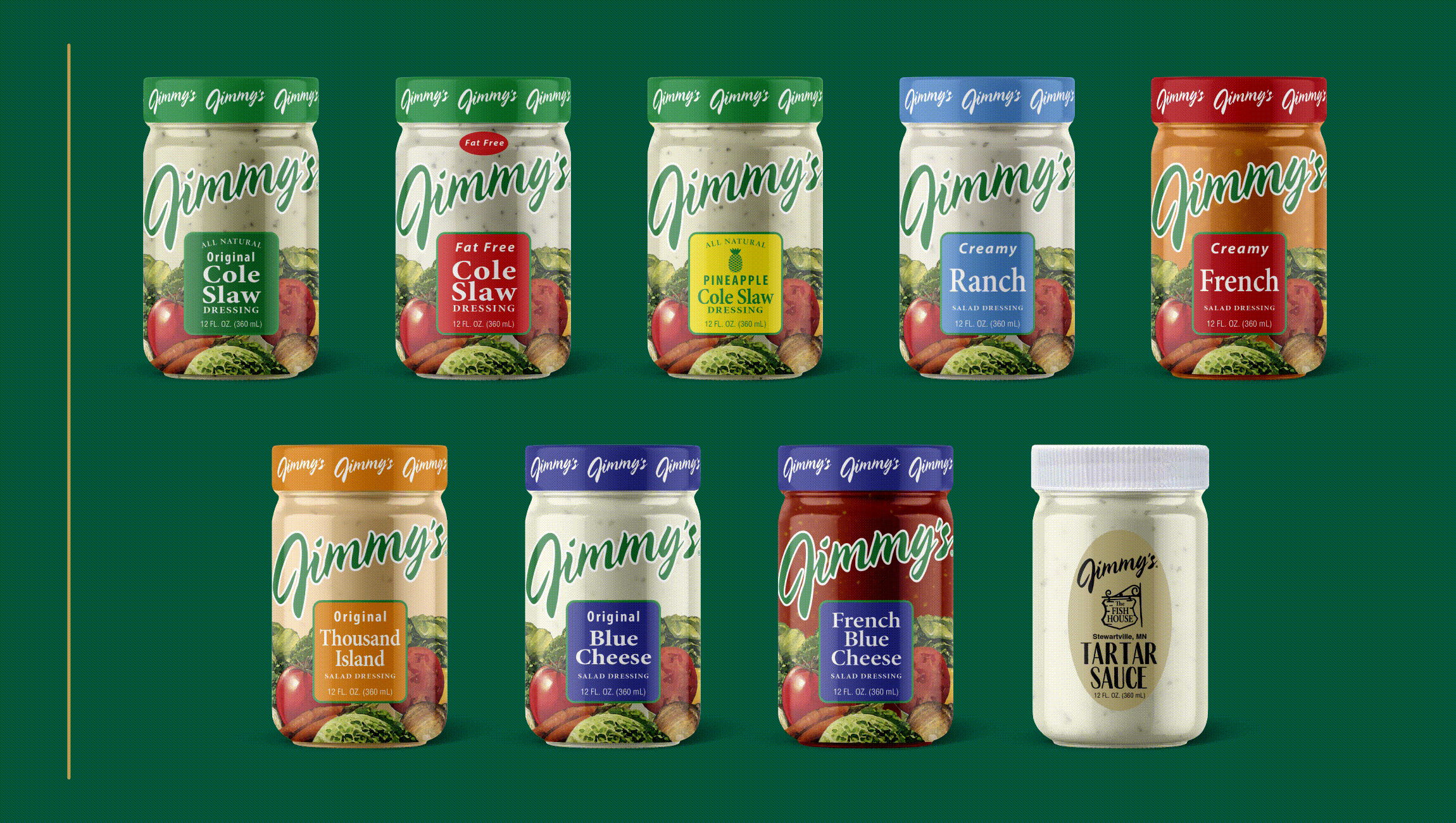
Jimmy’s is a well-loved local brand with deep roots in Minnesota. But as the food packaging landscape evolved, their labels began to blend in with larger national competitors.
Our brand design team faced the challenge of creating a brand refresh that honored the legacy and familiarity of Jimmy’s while modernizing its appeal. The previous packaging lacked distinction on crowded shelves, so we set out to elevate the brand with more clarity, shelf impact, and premium cues while keeping its approachable, small-batch authenticity.
Solution:
Our approach focused on evolution, not reinvention.
We refined the typography, color palette, and structure to feel modern yet familiar, creating a visual refresh that captured Jimmy’s Midwest brand identity while keeping it instantly recognizable. The updated packaging system balances clean design with character, resulting in a timeless look that is true to Jimmy’s story.


Design Inspiration:
Drawing inspiration from Jimmy’s supper club roots, we incorporated subtle vintage cues into the modern CPG design system. The refreshed look pays tribute to their heritage while positioning the brand for continued growth in the competitive food packaging category. It is a design that honors where they came from and builds excitement for where they are headed.