Nathan Riebel is a dynamic graphic designer with a strong background in:
︎︎︎ Brand Design
︎︎︎ Packaging
︎︎︎ Marketing Materials
︎︎︎ & More
Logo Design,
Brand Identity,
Website Design, Product Illustrations
2025
Role: Art Director / Designer
Creative Director / Designer: Eric Dallmann
Creative Director / Designer: Eric Dallmann

Challenge:
As a long-standing American padlock manufacturer, Sterling Security Systems was facing a very competitive landscape of other legacy brands and emerging tech-enabled lock products. Despite its reputation for reliability, value, and patented design, the company’s brand image no longer reflected its true strengths, feeling outdated and inconsistent. This created significant confusion for potential clients and made it difficult for Sterling to stand out, especially within the utility, industrial, and defense sectors. The brand needed an updated, authentic, and more American look that honored its heritage while presenting Sterling as the practical, blue-collar experts their customers can recognize right away and rely on.
As a long-standing American padlock manufacturer, Sterling Security Systems was facing a very competitive landscape of other legacy brands and emerging tech-enabled lock products. Despite its reputation for reliability, value, and patented design, the company’s brand image no longer reflected its true strengths, feeling outdated and inconsistent. This created significant confusion for potential clients and made it difficult for Sterling to stand out, especially within the utility, industrial, and defense sectors. The brand needed an updated, authentic, and more American look that honored its heritage while presenting Sterling as the practical, blue-collar experts their customers can recognize right away and rely on.
Solution:
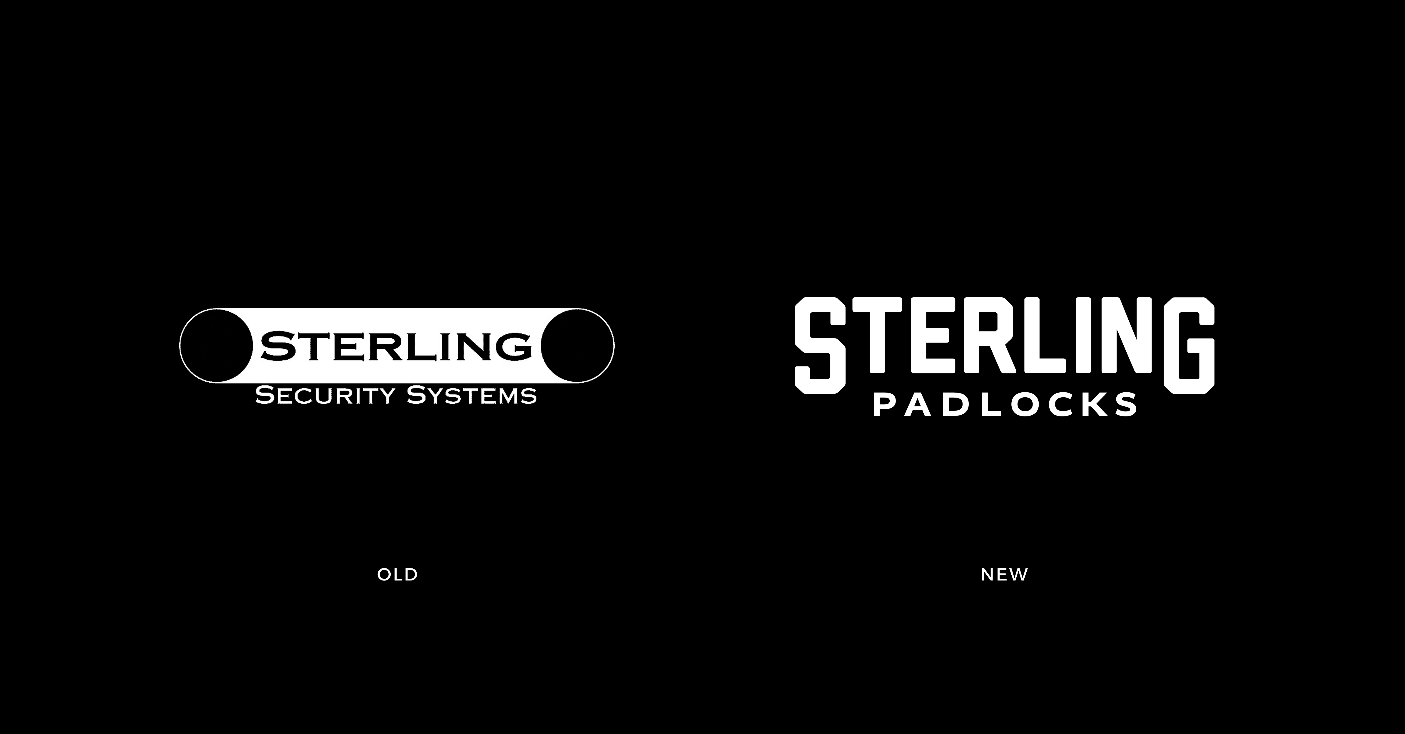
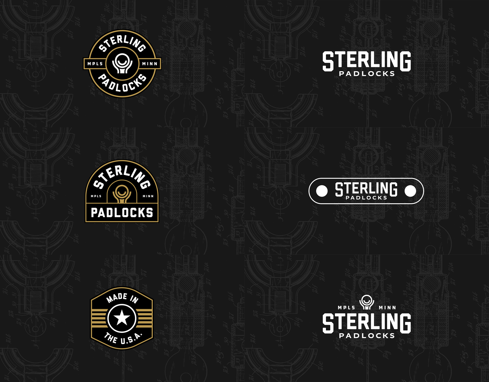
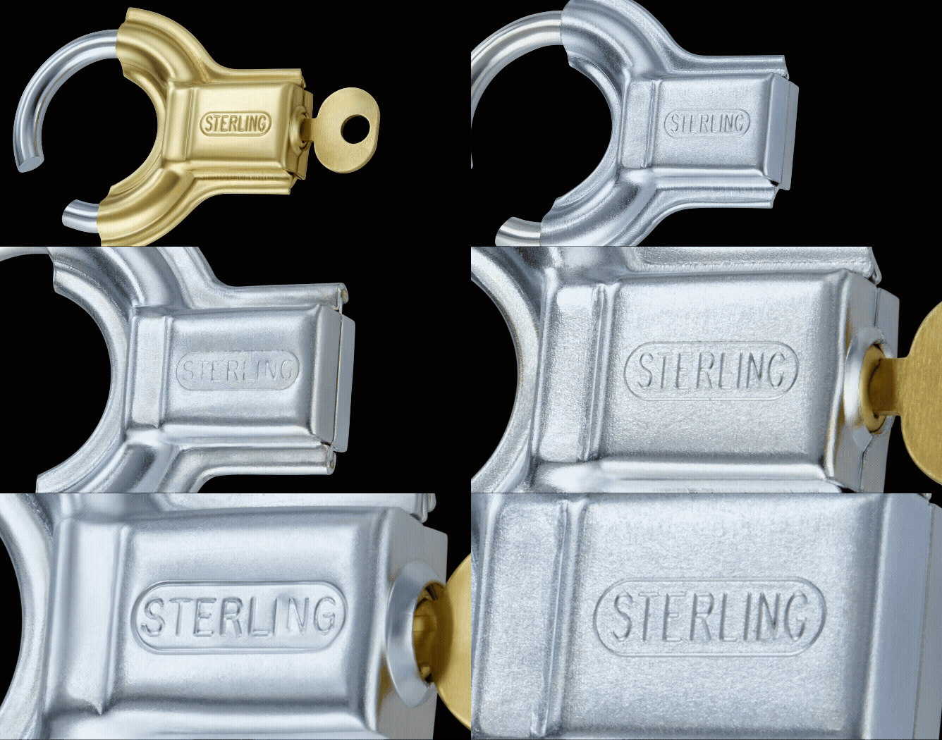
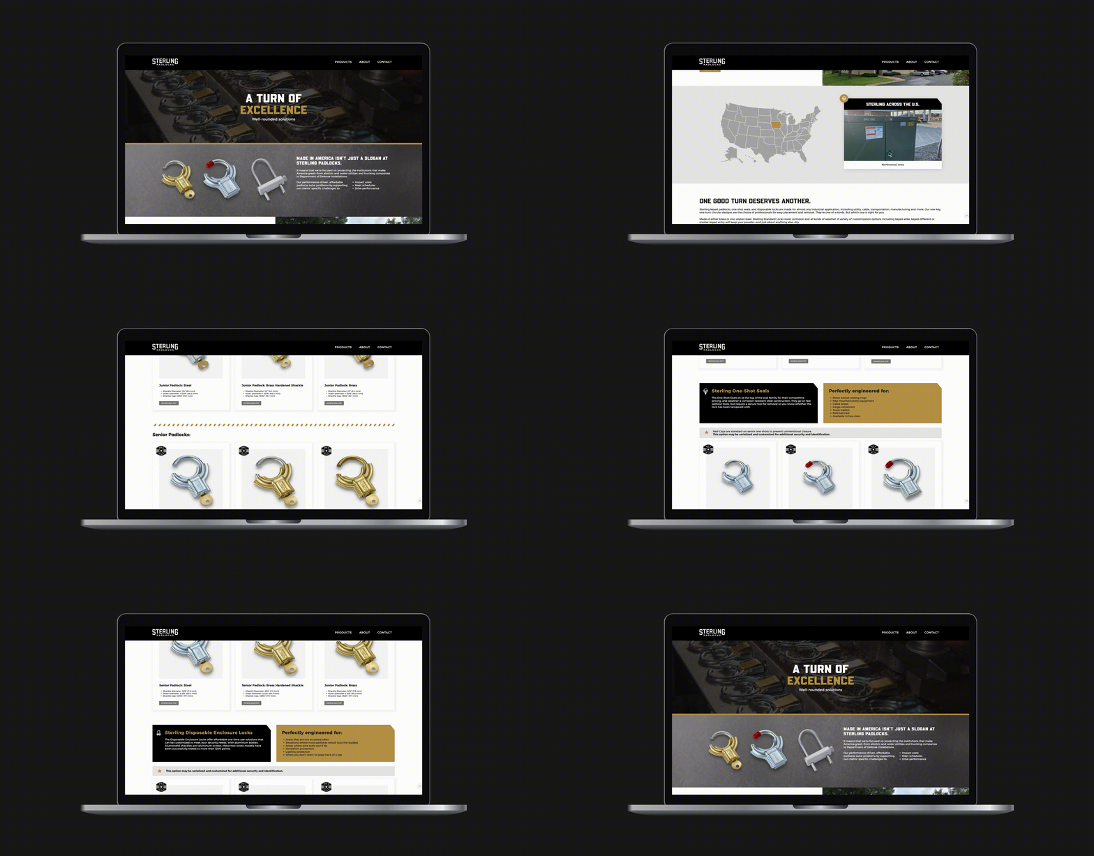
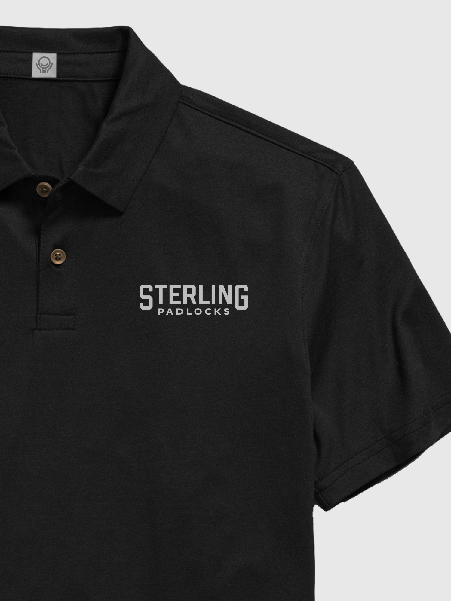
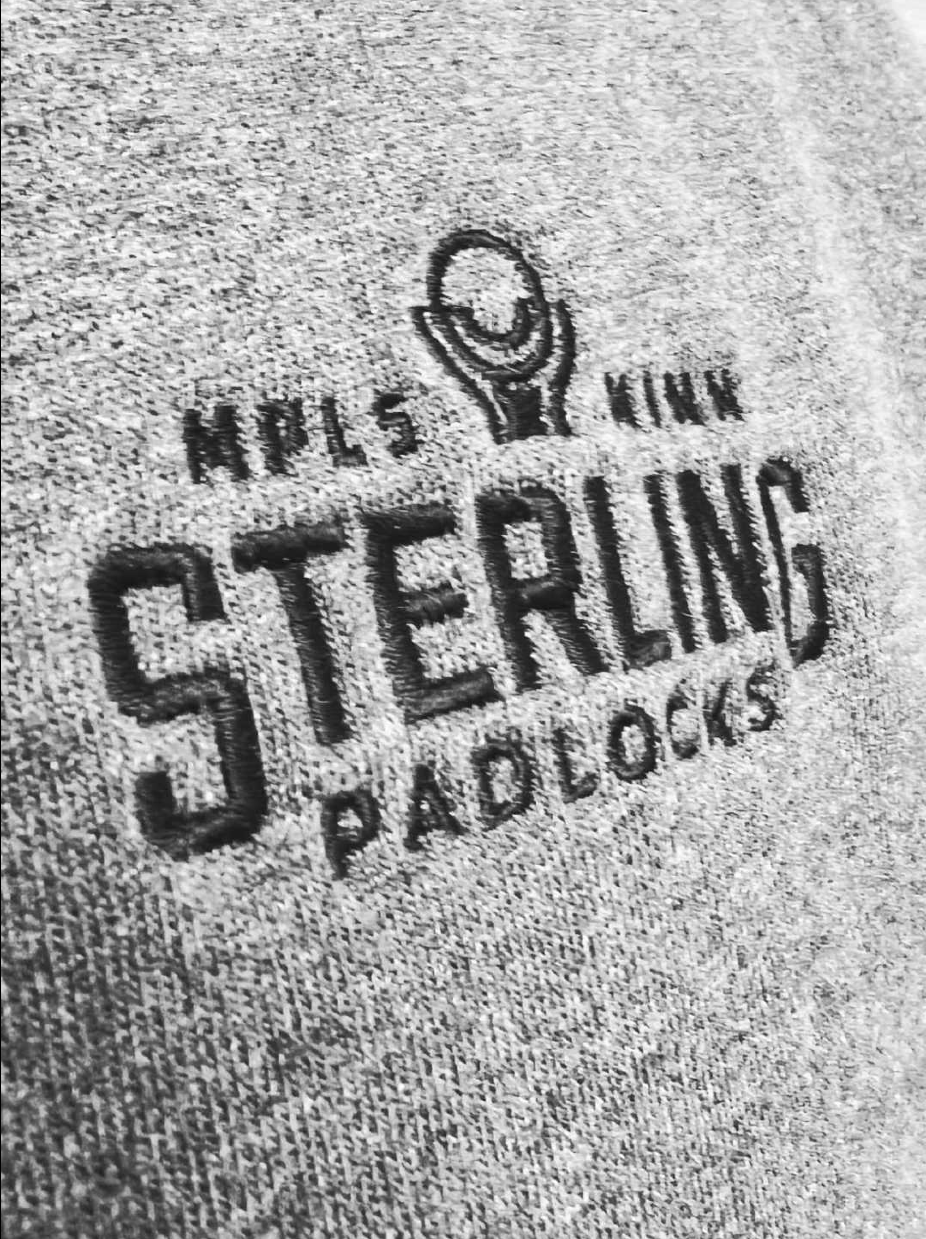
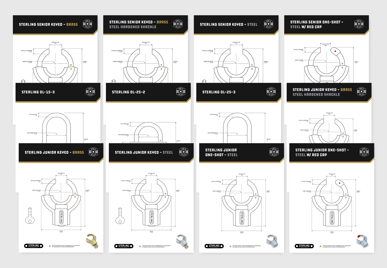
Sterling brought us in to help evolve their brand positioning, voice, and visual identity. Through a thorough brand exploration, we clarified the company’s mission, simplified the name to “Sterling Padlocks,” and developed a voice rooted in confidence, craftsmanship, and American-made value. The final visual deliverables included a logo inspired by the distinctive silhouette of their padlocks, a refreshed brand identity system, a modernized website, and detailed product illustrations. The refreshed brand feels trustworthy, straightforward, and approachable, which helps Sterling to produce ongoing marketing materials, attract new clients, and confidently show up at industry trade shows.
Sterling brought us in to help evolve their brand positioning, voice, and visual identity. Through a thorough brand exploration, we clarified the company’s mission, simplified the name to “Sterling Padlocks,” and developed a voice rooted in confidence, craftsmanship, and American-made value. The final visual deliverables included a logo inspired by the distinctive silhouette of their padlocks, a refreshed brand identity system, a modernized website, and detailed product illustrations. The refreshed brand feels trustworthy, straightforward, and approachable, which helps Sterling to produce ongoing marketing materials, attract new clients, and confidently show up at industry trade shows.
