Nathan Riebel is a dynamic graphic designer with a strong background in:
︎︎︎ Brand Design
︎︎︎ Packaging
︎︎︎ Marketing Materials
︎︎︎ & More
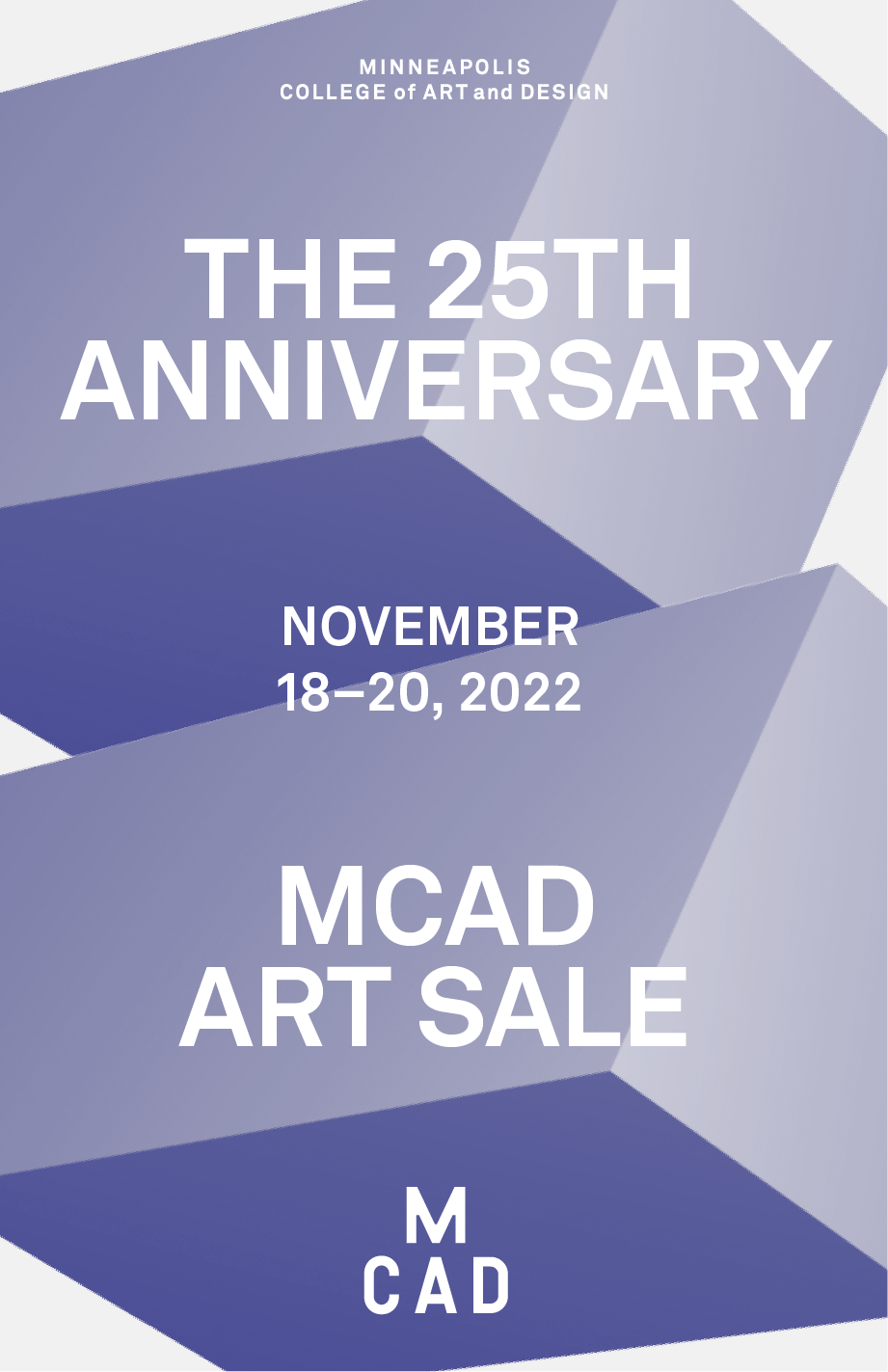
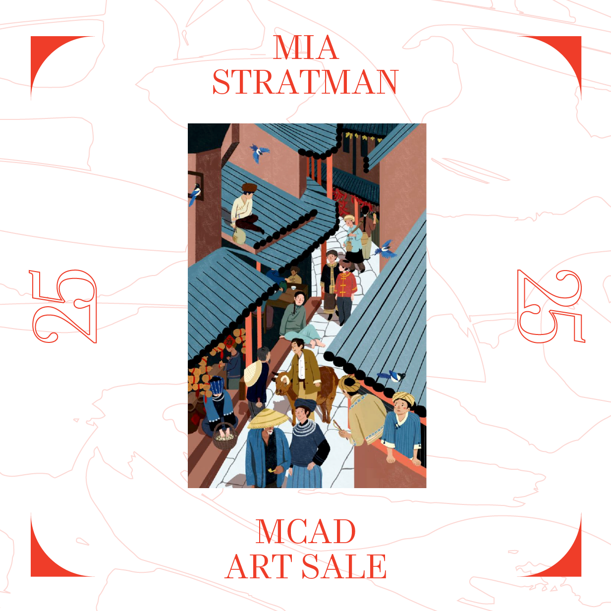
MCAD Art Sale
DesignWorks
Full Process
2022
1. Ask questions and write out answers.
Who’s the audience?
MCAD Community / General Public
What are the underpinnings of this project?
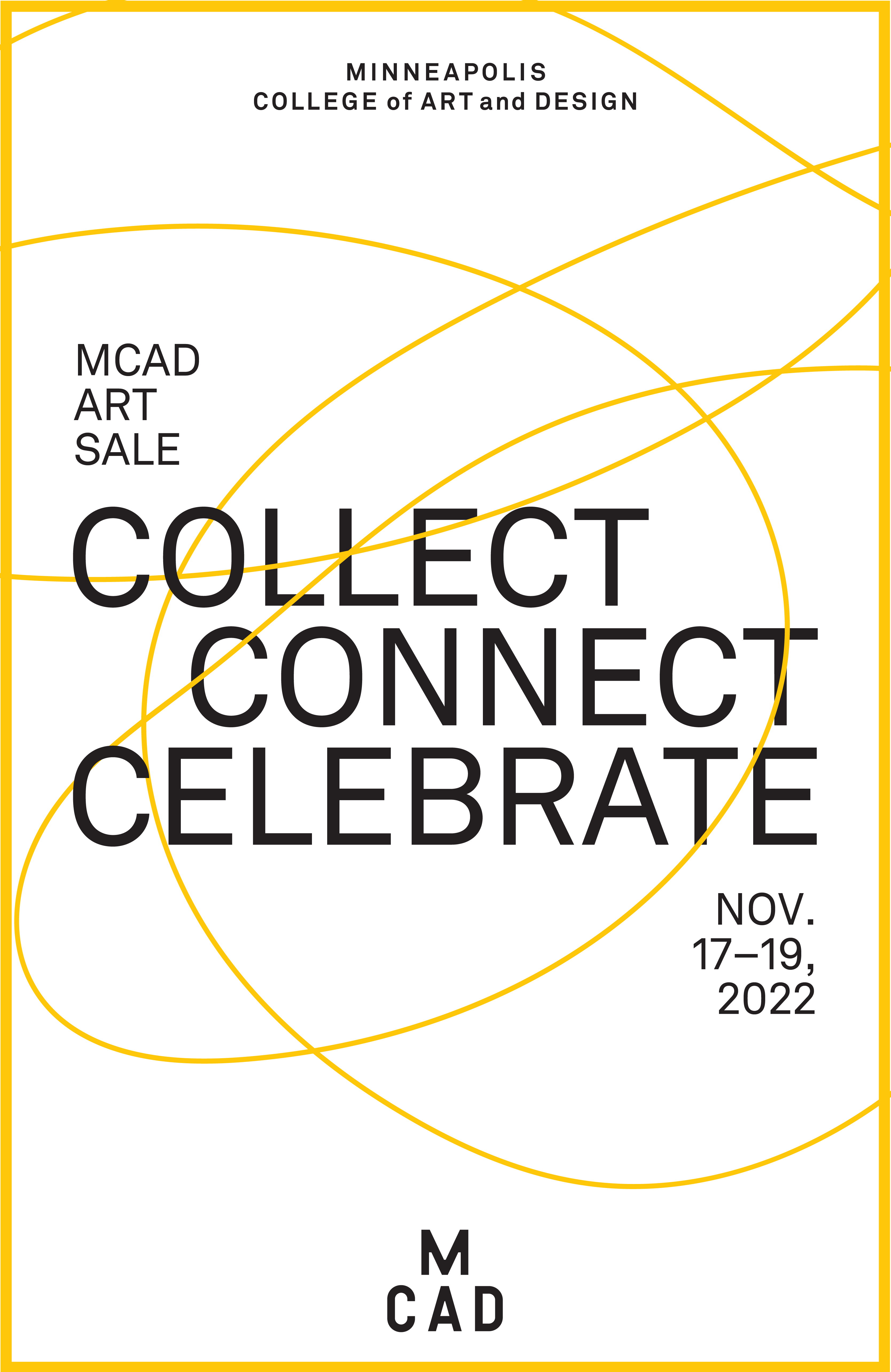
To create a branded design solution to celebrate the 25th Anniversary MCAD Art Sale.To highlight the wide variety of artwork made for sale by the talented MCAD creators.
The event was opened up to alumni who graduated from MCAD in the past 25 years.
What are the deliverables?
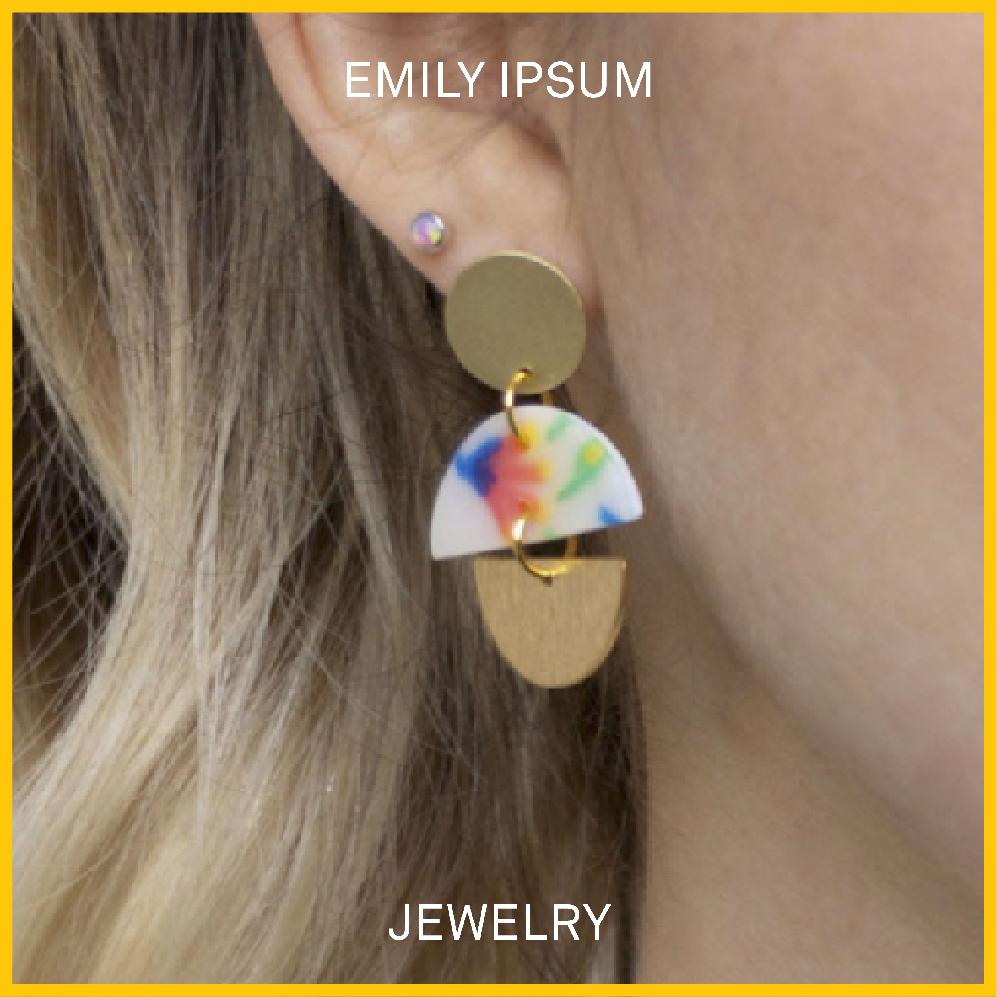
Digital Assets (Logo, Mailchimp Headers, Social Media Posts, Digital Ads)Printed Materials (Postcard, Invite, Event Guide, Menus)
Event Support (Title Wall, T-shirts, Tote Bags, Stanchions, Banners, Stair vinyl, Category signage)
What form will the end product be?
Promotion and branding for a 3-day event where people come to MCAD to browse and buy artwork What are my limitations?
To remain in the MCAD brand
Are all my design elements given to me?
MCAD Branding Elements (Color, Type, Logos)
Can I try a new design style/idea?
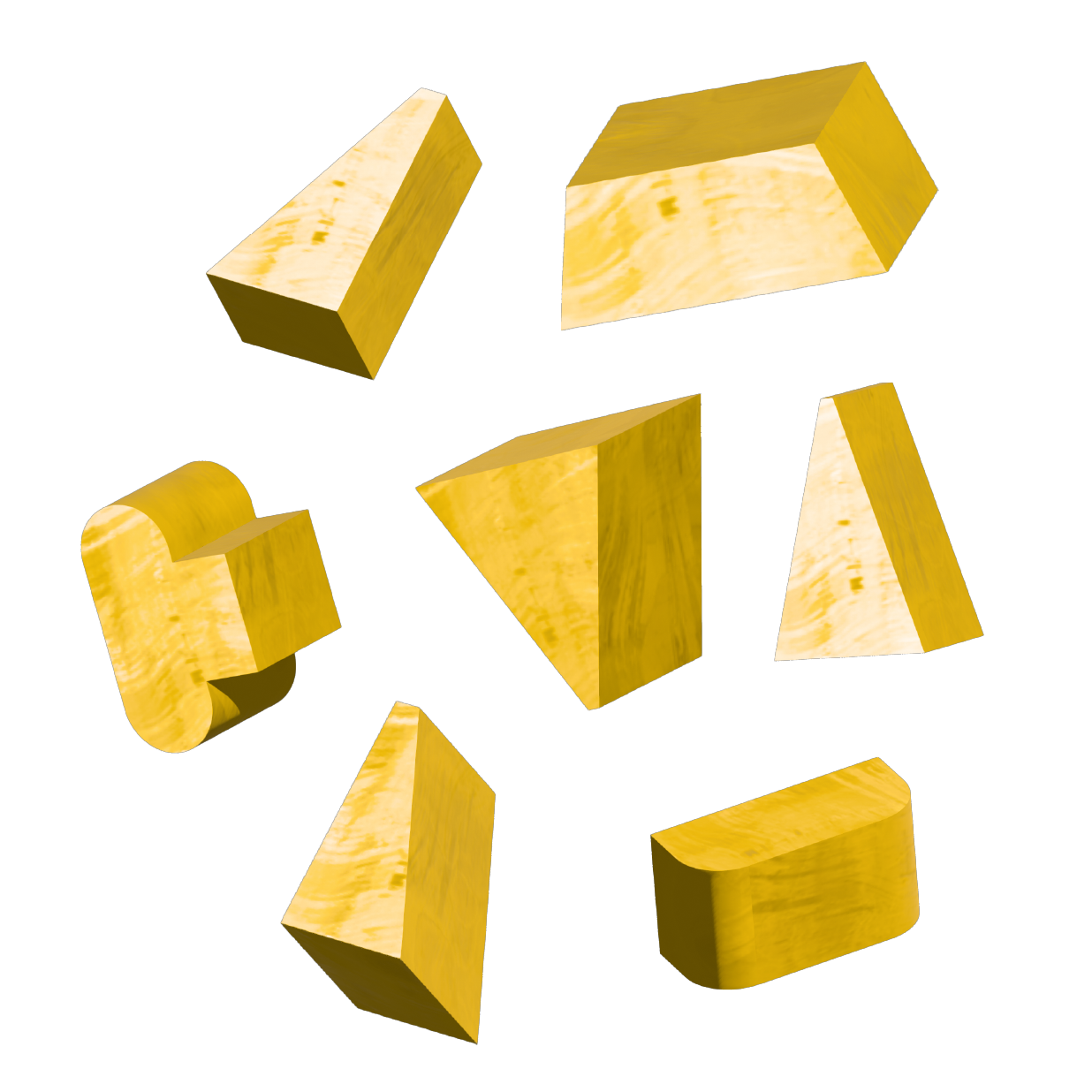
3D Elements.Motion to bring the energy.
2. Before starting to sketch, make sure that I have
answered most or all of those questions.
3. Look for inspiration with answers in mind.
- Motion
- Design elements
- Images to fit the vibe
- Projects done in similar formats


4. Set file size to final format of the deliverable(s).
Start sketching.
Direction 1:
![]()


Direction 2:


Direction 3:


Direction 4:


5. Once 2-5 solid ideas/directions emerge, step
back and ask more questions.
Are these aligning with the audience?
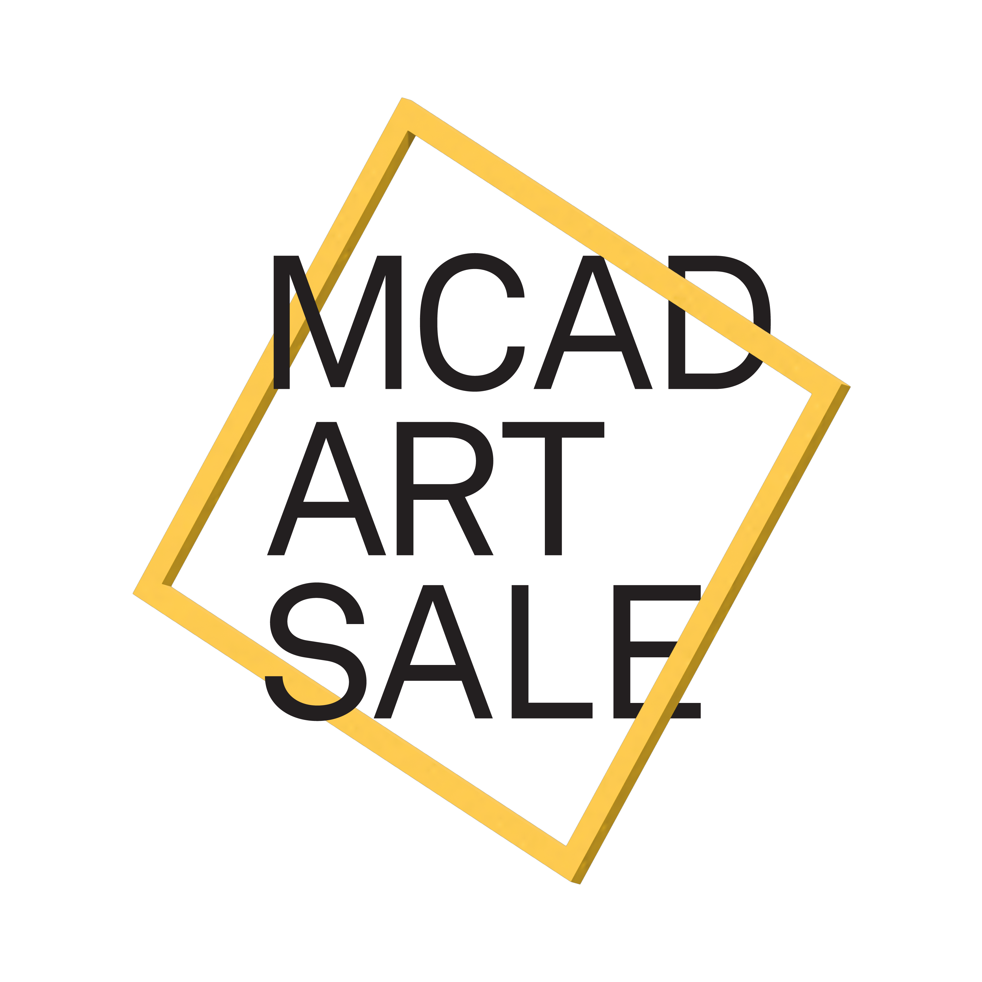
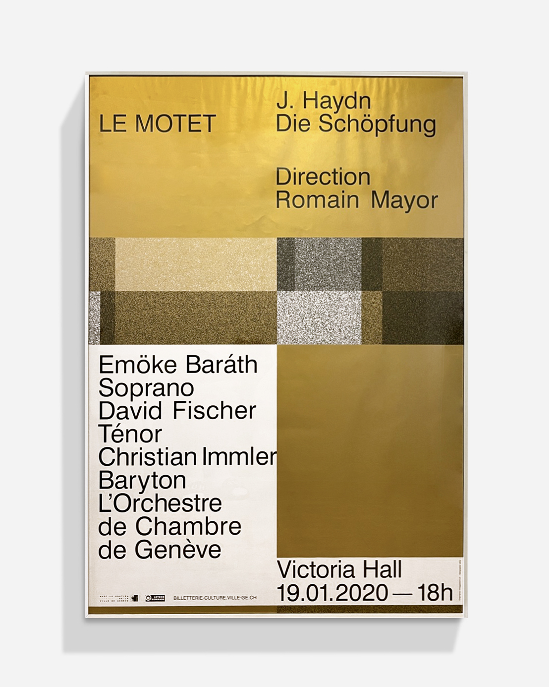
Direction 1 & 4 are fun and friendly than what we were looking forDirection 2 & 3 have a more high standard to them (Gold / type treatment)
Am I remaining inside of my limitations?
Yes. What is working the best / what isn’t working?
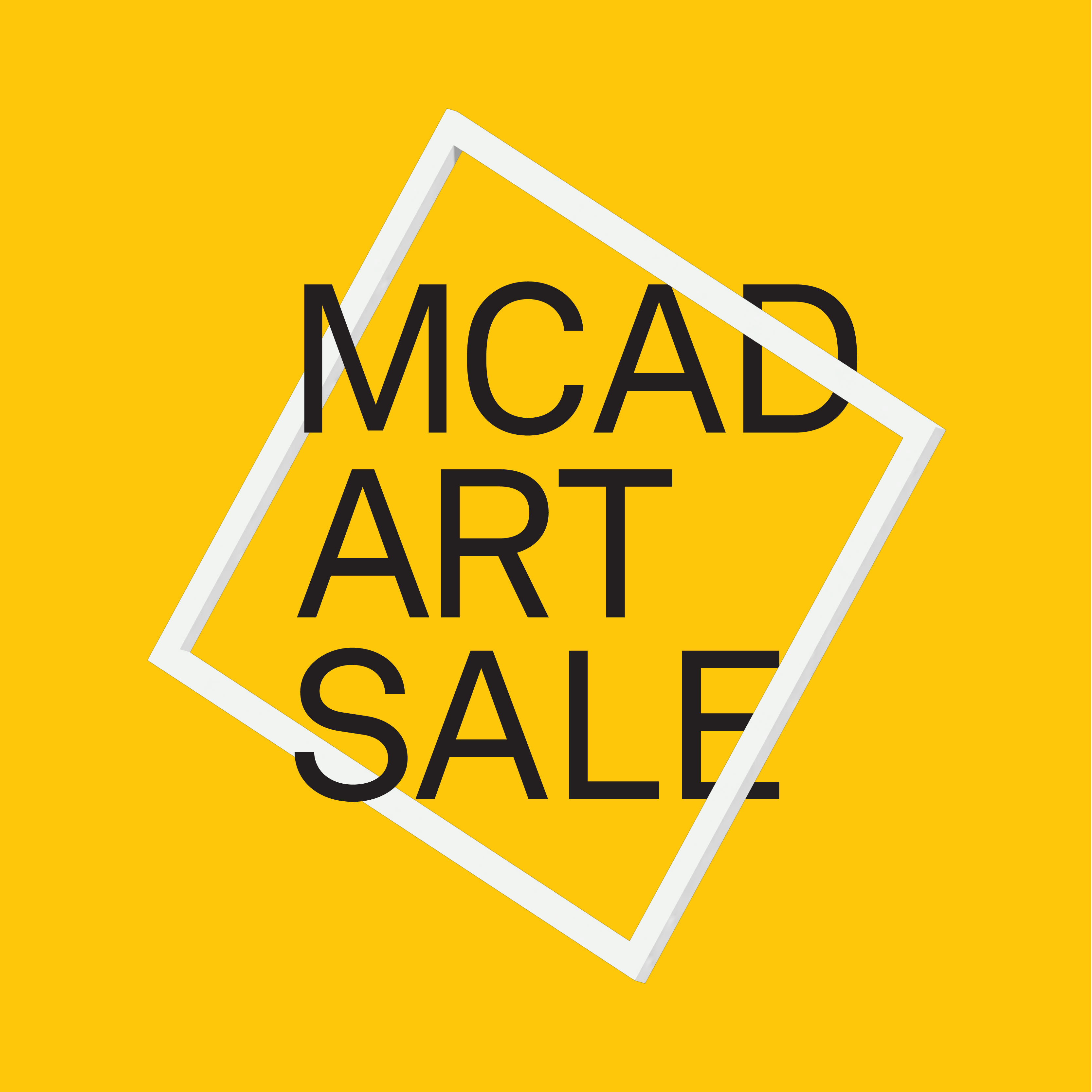
Direction 3 is working the best. The gold to highlight the 25th anniversary. The frame. No golden 3D shapes. Direction 1 & 4 is not hitting the targeted audience. But, we liked the bold type treatment in directions 1 & 4.
Direction 2 felt a little bit too high standard. The serif brand font made this feeling happen.
6. Eliminate directions if needed based on
questions,feedback, and personal feel.
7. Choose 1-2* directions (or final direction)
to refine / expand.